As the Winter quarter here at SCAD is finishing up and our final Form, Space, and Order projects are beginning, it's made me realize how much I've learned in the past couple of months! Not only have I become more comfortable and confident in diagramming the world around me (I now cannot NOT see every space I enter in diagram form!), but also in using the concepts and terms discussed in the blog in my own projects. I think by doing so, my own ideas and designs are much more thoughtful and organized than before.
Blogging has been a fun experience and thank you for reading!
Victoria
Sunday, March 6, 2011
Friday, March 4, 2011
Chapter 3: Form & Space
FORM & SPACE: THE UNITY OF OPPOSITES
As forms are molded and organized, space is created. When space is organized, enclosed, and captured, architecture is created. So, without forms, space cannot be defined; and without the two working together, architecture cannot come into being.
Picturing kitchen layouts helps to understand how forms and space work together. The cabinets, island, table, chairs, i.e. the forms determine the space of the kitchen. The kitchen in the photo below shows how those forms as well as the wall planes define the space and further break it up.


The diagram below simplifies how the kitchen would look from above. Notice how the black shapes (which represent the forms in the kitchen) dictate the space outline of the kitchen.

DEFINING SPACE WITH HORIZONTAL ELEMENTS
Spaces can be defined by different types of horizontal planes. Think of sitting on a blanket in the grass for a picnic. The edges of the blanket define the space and boundaries where you keep your basket, food, etc. The space can be further defined with a contrasting plane, such as a white blanket on the green grass rather than a green blanket. The blanket would be considered a base plane
Other ways to define spaces using horizontal planes include a elevated base plane (e.g. a stage), a depressed base plane (e.g. an in-ground pool), and an overhead plane which is discussed below.
The interior space in the picture below is a great example of the use of an overhead plane defining space. Traditionally, we see white ceilings in residential spaces and draw little attention to them. However, in this space, the overhead plane is obvious and its surface articulation helps to define the space below even more.


The diagram below shows how the overhead plane works with the ground plane to create a space in between:

DEFINING SPACE WITH VERTICAL LINEAR ELEMENTS
Just as horizontal elements define spaces, vertical elements also do. Vertical elements and planes have a strong impact on how we perceive and relate to the spaces around us... more so than horizontal elements because vertical elements limit the distance we can see and move. For example, a space with four vertical walls not only contains us more, but also seems to be more defined than a space than that with just a ceiling and floor. So, obviously vertical elements are extremely important in interior design as they set boundaries for what is the exterior and what is the interior, for one.
The picture below illustrates how vertical planes and elements (the short walls and adjacent columns) help to define spaces within spaces: they separate the work and living spaces which otherwise, would be in one space.


The diagram below illustrates how the vertical elements in this space would appear from above:

This example shows two ways vertical planes define spaces. First, the four planes (walls) create a closed space. Second, the two planes (the combination of the short walls and columns) are parallel to two of the main planes creating a space within them.
OPENINGS IN SPACE-DEFINING ELEMENTS
The space in the picture above also illustrates another way form and space work together with openings between planes. If you think of the short walls and columns starting as a one continuous plane and then an opening spanning from the floor to the ceiling is cut out creating two planes, the two adjacent spaces are then connected. The opening lessens the definition of the spaces. Openings between planes can be vertical (as in this case), or horizontal; on the ceiling or on the floor.
Openings can also be at the corners of a space. When this happens the space takes on a diagonal direction and also erode the definition of the space. Openings can also be within planes, such as a cut-out in the wall like in the space in the picture below.


The diagram below shows how an opening within a plane creates a focal point, dictates the form around it, and organizes the spaces that are now connected.

QUALITIES OF ARCHITECTURAL SPACE
As you might suspect at this point, the architectural qualities of a space help to define form and space. They help to determine the degree of enclosure, view, and light qualities of a space.
A space with little or no openings is well defined and has a high degree of enclosure. When a space does have an opening, a view or focal is created and how the forms and spaces around it are organized is key. Also, openings reveal light whether from outside or from another room. Light illuminates forms, surfaces, and shapes in spaces.
The space in the image below illustrates the idea of degree of enclosure. Walls or the absence of them, and the use of columns, arches, and window openings create a unique form and space relationship. The degree of enclosure is key to the success of this space.


As it is an outdoor space adjacent to a house, the degree of enclosure in probably mid-range. While in the space, the users would feel halfway inside and halfway outside which is ideal as a transitional space. This is illustrated in the diagram below that shows the space and forms from above.

I hope that clarifies how form and space work together!
As forms are molded and organized, space is created. When space is organized, enclosed, and captured, architecture is created. So, without forms, space cannot be defined; and without the two working together, architecture cannot come into being.
Picturing kitchen layouts helps to understand how forms and space work together. The cabinets, island, table, chairs, i.e. the forms determine the space of the kitchen. The kitchen in the photo below shows how those forms as well as the wall planes define the space and further break it up.


Photo found at: http://www.elledecor.com/image/tid/5476?page=11&pause=1
The diagram below simplifies how the kitchen would look from above. Notice how the black shapes (which represent the forms in the kitchen) dictate the space outline of the kitchen.

DEFINING SPACE WITH HORIZONTAL ELEMENTS
Spaces can be defined by different types of horizontal planes. Think of sitting on a blanket in the grass for a picnic. The edges of the blanket define the space and boundaries where you keep your basket, food, etc. The space can be further defined with a contrasting plane, such as a white blanket on the green grass rather than a green blanket. The blanket would be considered a base plane
Other ways to define spaces using horizontal planes include a elevated base plane (e.g. a stage), a depressed base plane (e.g. an in-ground pool), and an overhead plane which is discussed below.
The interior space in the picture below is a great example of the use of an overhead plane defining space. Traditionally, we see white ceilings in residential spaces and draw little attention to them. However, in this space, the overhead plane is obvious and its surface articulation helps to define the space below even more.


Photo found at: http://www.elledecor.com/image/tid/6244?page=0&pause=1
The diagram below shows how the overhead plane works with the ground plane to create a space in between:

DEFINING SPACE WITH VERTICAL LINEAR ELEMENTS
Just as horizontal elements define spaces, vertical elements also do. Vertical elements and planes have a strong impact on how we perceive and relate to the spaces around us... more so than horizontal elements because vertical elements limit the distance we can see and move. For example, a space with four vertical walls not only contains us more, but also seems to be more defined than a space than that with just a ceiling and floor. So, obviously vertical elements are extremely important in interior design as they set boundaries for what is the exterior and what is the interior, for one.
The picture below illustrates how vertical planes and elements (the short walls and adjacent columns) help to define spaces within spaces: they separate the work and living spaces which otherwise, would be in one space.


Photo found at: http://www.elledecor.com/image/tid/6244?page=2&pause=1
The diagram below illustrates how the vertical elements in this space would appear from above:

This example shows two ways vertical planes define spaces. First, the four planes (walls) create a closed space. Second, the two planes (the combination of the short walls and columns) are parallel to two of the main planes creating a space within them.
OPENINGS IN SPACE-DEFINING ELEMENTS
The space in the picture above also illustrates another way form and space work together with openings between planes. If you think of the short walls and columns starting as a one continuous plane and then an opening spanning from the floor to the ceiling is cut out creating two planes, the two adjacent spaces are then connected. The opening lessens the definition of the spaces. Openings between planes can be vertical (as in this case), or horizontal; on the ceiling or on the floor.
Openings can also be at the corners of a space. When this happens the space takes on a diagonal direction and also erode the definition of the space. Openings can also be within planes, such as a cut-out in the wall like in the space in the picture below.


Photo found at: http://www.elledecor.com/image/tid/5476?page=6&pause=1
The diagram below shows how an opening within a plane creates a focal point, dictates the form around it, and organizes the spaces that are now connected.

QUALITIES OF ARCHITECTURAL SPACE
As you might suspect at this point, the architectural qualities of a space help to define form and space. They help to determine the degree of enclosure, view, and light qualities of a space.
A space with little or no openings is well defined and has a high degree of enclosure. When a space does have an opening, a view or focal is created and how the forms and spaces around it are organized is key. Also, openings reveal light whether from outside or from another room. Light illuminates forms, surfaces, and shapes in spaces.
The space in the image below illustrates the idea of degree of enclosure. Walls or the absence of them, and the use of columns, arches, and window openings create a unique form and space relationship. The degree of enclosure is key to the success of this space.


As it is an outdoor space adjacent to a house, the degree of enclosure in probably mid-range. While in the space, the users would feel halfway inside and halfway outside which is ideal as a transitional space. This is illustrated in the diagram below that shows the space and forms from above.

I hope that clarifies how form and space work together!
Friday, February 11, 2011
Chapter 6: Proportion & Scale
Proportion and scale are two terms that are often confused, so let us clarify! Proportion refers to how a part relates to another part or to the whole while scale refers to the size of something compared to something else.
The theories of proportion discussed below will help to explain the what proportion is and how it can create good design.
GOLDEN SECTION
The Golden Section is based on observations in nature and mathematical formulas. It can be best understood with the help of this diagram:

This illustrates the Golden Section as the whole is able to be subdivided into proportional parts...the largest square has the same dimensional ratio as the second largest, third largest, and so on. This means that the algebraic equation in the diagram above holds true.
The Golden Section has been used since the days of antiquity and once again became of great interest in the Renaissance and continues to be with modern designers. As for interior designers, the concepts of the Golden Section can be used in many ways including how its is used below.


The shapes of the door frame (b) and window pane (a) are in proportion to each other. This creates a harmonious and aesthetically pleasing relationship between a part and its whole.
The diagram below simplifies the proportioning system of the Golden Section:

THE ORDERS
"The Orders" refers to the classical order of columns. Romans and Greeks used the diameter of a column to be the basis of a proportioning system which created beauty and harmony in architecture as a whole...again, showing how proportion relates the parts to its whole. The diameter of the column determined the dimensions of the shaft, capital, the pedestal, the spacing between the columns, and so on. There are five common forms of orders: Tuscan, Doric, Ionic, Corinthian, and Composite (listed from stockiest and simplest in decoration to more slender and ornamental). Since each has a distinct look, each shows different proportions in relation to the whole column. For example, if there were a Tuscan column and a Corinthian column of the same height next to each other, the shaft of a Tuscan column would not share the same dimensions as the Corinthian.
The picture below of a new construction house illustrates how columns and proportion relate.


Although the architecture of the house is not built with the columns as the basis for proportion, it shows a contemporary use of columns as an integral part of proportion. Imagine if the columns were wider or slimmer... the house would seem off. As it is, the columns are in proper proportion to the house a whole helping to create a harmonious design.
The diagram below shows how the parts are determining the rest of the design:

RENAISSANCE THEORIES
This concept refers to the ideal room dimensions Renaissance architects developed to bring their architecture to a higher level. These architects derived spatial units from Pythagoras' ratios and the Greek musical scale. Seven ideal plan shapes for room were decided upon by one of the most influential architects of the Italian Renaissance, Andrea Palladio: circle, square, 1:√2, 3:4, 2:3, 3:5, and 1:2.
For interior designers, the shape of a room plays a major part in the overall design. It may present problems or opportunities as in the space pictured below:


Suppose this room is square, one of the ideal room shapes. This gives the designer the opportunity to create a symmetrical, centralized space which would add to the formal-ness and strength of the space which is often a goal for dining rooms. Putting a circular table in the middle of the room with a strong light fixture above does just that.
This diagram relates to how this floor plan might look:

THE MODULAR
This system of proportioning was developed in the 1940s by Le Cobusier and is based on mathematics and the proportions of the human body. He came up with a system of numbers that could determine lengths, volumes, and surfaces while maintaining the human scale in his architecture.
Le Corbusier used the Modular system to bring human scale to the Unite d'Habitation at Marseilles shown below:


He used a variety of panel sizes and surfaces to show the diversity of the Modular system. The diagram below shows an example of the some of the facades using his proportional system:

THE "KEN"
This is a Japanese proportional system that uses the dimensions of floor mats to determine the size of a room, column spacing, and room height. Floor mats typically have a 1:2 ratio and therefore can be arranged in a variety of ways.
The room below is an example of how the Ken is used. Notice how the floor mats fit perfectly in the spaces creating a unified whole:


This diagram illustrates an example of a 6 mat room layout:

ANTHROPOMORPHIC
This refers to basing measurements and proportions on how the human body interacts with space and the items in it.
For interior designers, these proportions are especially important as they affect our ability to function in a space. Take this simple living room furniture set up:


This arrangement shows the concept of anthropometry and how our spaces have to work with the proportion and measurements of our bodies. The seat height relates to the height of the coffee table height in a way that make sense when they are being used together. The furniture is used in a proper proportion to the size of the room so that there is adequate space for circulation.
The diagram suggests the human movement needed to be accommodated while sitting in a chair:

SCALE
As stated at the very beginning of this post, scale refers to the relationship of size between one object and another. Often, we are given cues to how to relate the size of objects to each other. For example, in architecture, doors are typically a good indicator of the scale of a structure.


The diagram below shows how scale relates the size of two objects:

The theories of proportion discussed below will help to explain the what proportion is and how it can create good design.
GOLDEN SECTION
The Golden Section is based on observations in nature and mathematical formulas. It can be best understood with the help of this diagram:

photo from Francis D.K. Ching's Architecture: Form, Space, and Order, page 303
This illustrates the Golden Section as the whole is able to be subdivided into proportional parts...the largest square has the same dimensional ratio as the second largest, third largest, and so on. This means that the algebraic equation in the diagram above holds true.
The Golden Section has been used since the days of antiquity and once again became of great interest in the Renaissance and continues to be with modern designers. As for interior designers, the concepts of the Golden Section can be used in many ways including how its is used below.


The shapes of the door frame (b) and window pane (a) are in proportion to each other. This creates a harmonious and aesthetically pleasing relationship between a part and its whole.
The diagram below simplifies the proportioning system of the Golden Section:

THE ORDERS
"The Orders" refers to the classical order of columns. Romans and Greeks used the diameter of a column to be the basis of a proportioning system which created beauty and harmony in architecture as a whole...again, showing how proportion relates the parts to its whole. The diameter of the column determined the dimensions of the shaft, capital, the pedestal, the spacing between the columns, and so on. There are five common forms of orders: Tuscan, Doric, Ionic, Corinthian, and Composite (listed from stockiest and simplest in decoration to more slender and ornamental). Since each has a distinct look, each shows different proportions in relation to the whole column. For example, if there were a Tuscan column and a Corinthian column of the same height next to each other, the shaft of a Tuscan column would not share the same dimensions as the Corinthian.
The picture below of a new construction house illustrates how columns and proportion relate.


Although the architecture of the house is not built with the columns as the basis for proportion, it shows a contemporary use of columns as an integral part of proportion. Imagine if the columns were wider or slimmer... the house would seem off. As it is, the columns are in proper proportion to the house a whole helping to create a harmonious design.
The diagram below shows how the parts are determining the rest of the design:

RENAISSANCE THEORIES
This concept refers to the ideal room dimensions Renaissance architects developed to bring their architecture to a higher level. These architects derived spatial units from Pythagoras' ratios and the Greek musical scale. Seven ideal plan shapes for room were decided upon by one of the most influential architects of the Italian Renaissance, Andrea Palladio: circle, square, 1:√2, 3:4, 2:3, 3:5, and 1:2.
For interior designers, the shape of a room plays a major part in the overall design. It may present problems or opportunities as in the space pictured below:


Suppose this room is square, one of the ideal room shapes. This gives the designer the opportunity to create a symmetrical, centralized space which would add to the formal-ness and strength of the space which is often a goal for dining rooms. Putting a circular table in the middle of the room with a strong light fixture above does just that.
This diagram relates to how this floor plan might look:

THE MODULAR
This system of proportioning was developed in the 1940s by Le Cobusier and is based on mathematics and the proportions of the human body. He came up with a system of numbers that could determine lengths, volumes, and surfaces while maintaining the human scale in his architecture.
Le Corbusier used the Modular system to bring human scale to the Unite d'Habitation at Marseilles shown below:
He used a variety of panel sizes and surfaces to show the diversity of the Modular system. The diagram below shows an example of the some of the facades using his proportional system:

THE "KEN"
This is a Japanese proportional system that uses the dimensions of floor mats to determine the size of a room, column spacing, and room height. Floor mats typically have a 1:2 ratio and therefore can be arranged in a variety of ways.
The room below is an example of how the Ken is used. Notice how the floor mats fit perfectly in the spaces creating a unified whole:


Photo found at http://pixdaus.com/pics/12608310717JuXmnt.jpg
This diagram illustrates an example of a 6 mat room layout:

ANTHROPOMORPHIC
This refers to basing measurements and proportions on how the human body interacts with space and the items in it.
For interior designers, these proportions are especially important as they affect our ability to function in a space. Take this simple living room furniture set up:


Photo found at http://www.traditionalhome.com/design_decorating/howwelive/atlanta-colonial-remodel_ss4.html
This arrangement shows the concept of anthropometry and how our spaces have to work with the proportion and measurements of our bodies. The seat height relates to the height of the coffee table height in a way that make sense when they are being used together. The furniture is used in a proper proportion to the size of the room so that there is adequate space for circulation.
The diagram suggests the human movement needed to be accommodated while sitting in a chair:
SCALE
As stated at the very beginning of this post, scale refers to the relationship of size between one object and another. Often, we are given cues to how to relate the size of objects to each other. For example, in architecture, doors are typically a good indicator of the scale of a structure.


The diagram below shows how scale relates the size of two objects:
Saturday, February 5, 2011
Chapter 2: Form
The term "form" has so many meanings but, in design, it refers to formal structure, both inside and out, the outline, and the unity of the parts to its whole.
Form has visual properties of shape, size, color, and texture and relational properties of position, orientation, and visual inertia.
There are several important terms and concepts to discuss to give a clearer explanation of form: Primary Solids, Dimensional Transformation, Subtractive Forms, Additive Forms, and Formal Collision of Geometry.
PRIMARY SOLIDS
It's best to first talk about the most basic of form: primary solids, including the sphere, cylinder, cone, pyramid, cube which are generated from one or two primary shapes (circle, square, and triangle). All of these forms are considered regular forms because its parts are related to one another in an organized manner...they are symmetrical and stable. But remember, if there are regular forms, there are also irregular forms which tend to show asymmetry and are more dynamic. Often the two types are seen working together in one composition.
The picture below includes primary solids: the light fixture is a sphere; the newel post on the stair is a rectangular cube; and the balusters are cylinders.


Saturday, January 29, 2011
Chapter 1: Primary Elements
Let's start at the very beginning...a very good place to start!
The most basic elements of form are point, line, plane, and volume. It is important to understand them as each one is created from the previous (e.g., a line is created by a point in motion). A more in depth explanation below:
POINT
Point can be defined as a position in space. It has no dimension and therefore no length, width, or height. It shows no movement or direction- it is static. However, point can be expressive. For instance, a point located in the middle of a field creates a stable, balanced, and organized environment. In contrast, a point that is off-center shows aggression and tension in its environment.
The picture of the bedroom below illustrates how effective the use of point can be in creating a successful interior space.


Imagine the black mirror as a point, and the wall its field. Because the point is centralized, a feeling of balance, simplicity, and peacefulness is created in the room. Also, points are marking the ends of the lines created by the chains coming from the fan which show another property of point. Along with marking the ends of a line, point also marks the intersection of two lines, the corner of a plane or volume, and the center of a field. With that being said, you can find points everywhere: the corners of the ceiling; the top of the lamp/the finial; the corners of the windows; and so on. Although the points are static themselves, the repetition of this element in a room creates visual rhythm which keeps your eye moving in the space.
Photo by Roger Davies, from the January 2011 issue of Southern Living magazine.
The diagram below illustrates how point relates to its environment. Some points are more visually dominant or mark important lines, planes, or volumes in a space.
LINE
Line is created when a point is extended or as Paul Klee stated, "A line is a dot that went for a walk". Line can be literal or implied. Lines have length, direction, and like point, position. Also like point, lines can be expressive. Horizontal, vertical, diagonal, thick, thin, curved, and every other type of line each have descriptive properties and visual abilities. For example, the use of strong horizontal lines in a space would emphasize calmness and rest.
The picture below shows how lines direct and create harmony in a space.

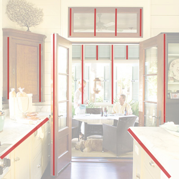
First, the diagonal lines created by the edges of the countertops draw the eye from the kitchen into the dining area. Diagonal lines are very active and create movement. And in this case, they define the edges of the pathway to the next room. Second, the repeated strong verticals across the kitchen (the cabinets on the left, the doors, and transom window)merge with the strong verticals in the next room, creating unity between the rooms... which, of course is especially important in interiors.
Photo by Laurey W. Glenn from the April 2010 issue of Southern Living magazine.
The diagram below shows how line can create direction and connection in a space.

PLANE
A plane is created when a line is extended in another direction giving it width. It has the properties of line (length and position), but also has width, shape, surface, and orientation. Having both length and width, planes are two-dimensional. Shape is usually the key to identifying a plane. Planes in general define the boundaries of a volume.
The picture below is a great example of planes and how the create boundaries.


Each facet of each shelf, the surface of the picture frame, and the side of the book are all planes. Not only do these opposing planes create interest on the wall of this room, but they also form spaces. For example, if you imagine the shelves simply as planes, the bottom shelf/plane, the middle shelf/plane, and the wall plane create a space in which the books and accessories can occupy. This idea can be carried through to interior rooms. In architecture, there are three types of planes: Overhead Planes (such as ceilings); Wall Planes; and Base Planes (floors). These planes create and define the spaces in which we occupy.


Each facet of each shelf, the surface of the picture frame, and the side of the book are all planes. Not only do these opposing planes create interest on the wall of this room, but they also form spaces. For example, if you imagine the shelves simply as planes, the bottom shelf/plane, the middle shelf/plane, and the wall plane create a space in which the books and accessories can occupy. This idea can be carried through to interior rooms. In architecture, there are three types of planes: Overhead Planes (such as ceilings); Wall Planes; and Base Planes (floors). These planes create and define the spaces in which we occupy.
Photo by Laurey W. Glenn from the January 2010 issue of Southern Living magazine.
The diagram below simplifies the idea of opposing planes.

VOLUME
Volume is created when a plane is extended in an opposing direction. It too has characteristics of length, width, surface, orientation, and position, but also has depth which creates form and space. It is the only three-dimensional element of the primary elements. Volume can either be a solid mass (such as a pillow) or a space contained by planes (a swimming pool). In interior design, you must relate the two types together to understand the forms and spaces more completely.
The picture below suggests the concept of spaces being created within other spaces, an idea that is a big part of interior design! But it also further clarifies what volume is.

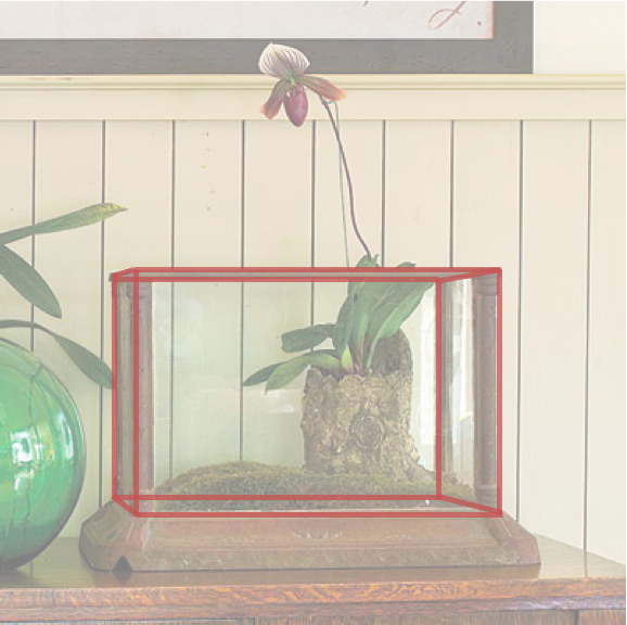
Since volume is the most complex of the primary elements and contains each of them, you can see the other three in this volume: The perpendicular planes of glass along with the base plane define the boundaries that contain the orchid plant; The metal edges of the volume represent the lines that are created where the two planes meet; And, the corners of the container are points where several lines and planes come together.
Photo by Tria Giovan from the October 2009 issue of Southern Living magazine.
http://www.southernliving.com/home-garden/decorating/craftsman-style-home-decorating-ideas-00400000064639/page13.html
The diagram below illustrates a object within a volume.

I hope this has helped in understanding point, line, plane, and volume!
Subscribe to:
Posts (Atom)